McKinsey presentations decoded: What they include, what they exclude, and why it works


McKinsey presentations follow four principles. Lead with the answer (the Pyramid Principle). One idea per slide. Data presented as a story. Executive-ready formatting. Openings use the SCQA framework: Situation, Complication, Question, Answer. The result is decks that respect executive time and force clarity through structure.
A McKinsey associate writes the answer on slide one. A McKinsey partner cuts ten slides for every one that survives. Both habits trace to a choice the firm made in the 1960s: structure beats narrative. Today, that choice still shapes how the world's most influential consulting decks get built.
We analyzed the public McKinsey deck record, including the 44 decks catalogued by Plus AI, with deep dives into Women in the Workplace 2022 (McKinsey & Company), the 2023 DSNY Future of Trash report (prepared with McKinsey support), Jobs Lost, Jobs Gained (2017), and Reinventing Construction (2017). Across decades, industries, and clients ranging from the United Nations to Fortune 100 boards, the same patterns hold.
If you want to see these principles in action, our McKinsey-style presentation template applies SCQA, the Pyramid Principle, and consultant-grade formatting to your own client work.
The four principles that define McKinsey presentations
Across the public record of McKinsey decks, four principles surface again and again, regardless of industry, geography, or use case.
1. Pyramid Principle: answer first, supporting logic follows
The Pyramid Principle was created by Barbara Minto, the first female post-MBA hire at McKinsey, in the 1960s. While editing reports at McKinsey's Cleveland office, Minto noticed she was always reorganizing ideas into a pyramid shape. Her method became so effective that John Tomb, the Cleveland office manager, had her train all Associates on report-writing. Eventually, every McKinsey office adopted her approach. McKinsey's alumni network still credits Minto with shaping the firm's communication standards.
The Pyramid Principle inverted traditional business communication by putting the answer at the top of the structure, supported by key arguments, which are supported by data.
The structure has three levels:
Top level: The summary point (your answer or recommendation)
Second level: 3-5 key points that support the top-level recommendation
Third level: Data, analysis, and evidence supporting each second-level point
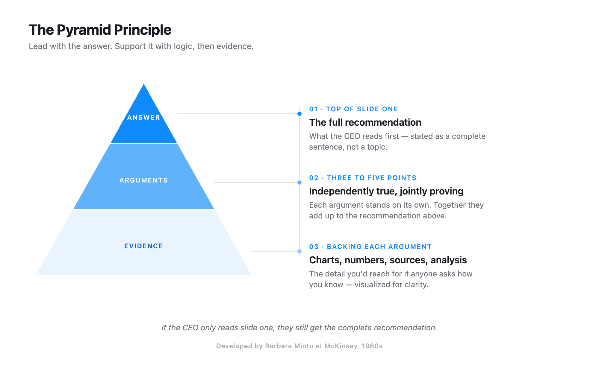
Why this works: Executive attention is the scarcest resource in the room. If a CEO only reads slide one, they get the complete recommendation. If they want depth, the logic is organized hierarchically. This structure respects time and ensures the key message lands regardless of how much of the deck gets read.
The strategic choice: McKinsey consultants bet that starting with the answer builds credibility faster than building suspense. They are right. In high-stakes business contexts, confidence signals expertise.
2. One idea per slide
McKinsey decks never try to communicate two points on a single slide. Each slide has one purpose, one insight, one message.
Why this works: Cognitive load. When a slide tries to make multiple points, the audience has to work to separate them. A single-focus slide is scannable in 5 seconds. This matters in board meetings where executives flip ahead while you are still speaking.
The strategic choice: McKinsey would rather have a 30-slide deck with perfect clarity than a 15-slide deck where each slide requires explanation.
3. Data-driven storytelling
Every claim in a McKinsey presentation is backed by evidence. But the data is presented as a story with a clear throughline, not as raw analysis. (For more on what executive-grade decks actually look like, see our breakdown of real pitch deck examples.)
Why this works: Data without narrative is just numbers. McKinsey consultants select data that advances the argument and visualize it in ways that make the insight obvious. The chart type is chosen specifically to make the conclusion unavoidable.
The strategic choice: McKinsey shows less data, not more. They exclude analysis that does not directly support the recommendation, even if that analysis was expensive to produce.
4. Executive-ready formatting
McKinsey slides are designed for boardrooms. Clean layouts, consistent formatting, strategic white space, and minimal text make complex information accessible to C-suite executives scanning between meetings.
Why this works: Visual consistency reduces cognitive load. When every slide follows the same grid, uses the same fonts, and structures information identically, the audience stops thinking about the format and focuses entirely on the content.
The strategic choice: McKinsey invests heavily in formatting because it signals rigor. A well-formatted deck suggests well-structured thinking. It is a proxy for quality.
The SCQA framework: McKinsey's opening structure
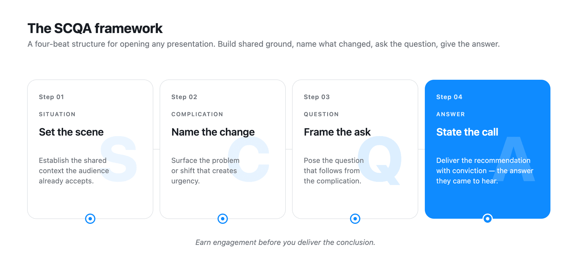
McKinsey consultants structure the opening of every presentation using SCQA: Situation, Complication, Question, Answer. This framework creates engagement and sets up the recommendation.
Situation: establish shared context
Start with facts the audience already knows and accepts. This establishes common ground.
Example: "Your company has been the market leader in retail banking for 15 years, with consistent 12% annual growth."
Why it works: Starting with agreement creates psychological safety. The audience nods along, building trust before you introduce tension.
Complication: introduce the problem
Describe what changed, what is wrong, or what opportunity emerged. This disrupts the comfortable situation.
Example: "However, digital-first competitors have captured 40% of new account openings in the past 18 months, and your growth rate has declined to 3%."
Why it works: Tension creates urgency. Without a complication, there is no reason to act on your recommendation.
Question: focus the analysis
State the question that naturally arises from the complication.
Example: "How should you respond to digital competition while maintaining your core customer relationships?"
Why it works: The question focuses everyone on the same problem. It prevents the conversation from drifting to adjacent issues.
Answer: state the recommendation
The top of your pyramid: the core recommendation, stated clearly.
Example: "Launch a digital-first subsidiary targeting customers under 35, while enhancing personalization for your existing customer base."
Why it works: By the time you reach the answer, you have earned the right to be direct. The audience is primed to hear your recommendation.
How SCQA and the Pyramid Principle work together
SCQA frames the opening (slides 1-3). The Pyramid Principle structures the supporting analysis (the rest of the deck). Together, they create presentations that are both engaging and logically rigorous.
The same SCQA opening structure shows up in Bain and BCG decks too, which is why former consultants from any of the three firms tend to describe it as the universal default.
Some McKinsey consultants use a simplified variant called SCR (Situation-Complication-Resolution), which skips explicitly stating the question and jumps directly to the resolution.
Visual design choices that define McKinsey slides
McKinsey presentations have a distinctive look. These are not aesthetic choices. They are functional decisions based on how executives process information.
Minimal text: 30 words maximum per slide
McKinsey slides rarely exceed 30 words. They use short phrases and bullet points, never paragraphs.
Why it works: Text-heavy slides force the audience to choose between reading and listening. They cannot do both. Minimal text keeps attention on the speaker.
What they do instead: The header carries the weight. It states the conclusion in a complete sentence.
Headers that state conclusions, not topics
This is McKinsey's most distinctive design choice. Headers are complete sentences that communicate the point. Compare a generic corporate header against three real McKinsey headers from Women in the Workplace 2022:
Generic header: "Leadership representation analysis"
McKinsey header (slide 4): "Despite modest progress, women are still dramatically underrepresented in leadership"
McKinsey header (slide 5): "'The great breakup': women leaders are leaving their companies at the highest rate in years"
McKinsey header (slide 6): "The 'broken rung' is still broken. Women of color especially are less likely to overcome this barrier"
Why it works: A well-written McKinsey deck can be understood by reading headers alone. Read the three headers above and you already have the argument: leadership representation is stuck, attrition is accelerating it, and the entry barrier still penalizes women of color hardest. The charts and text support what the headers already state.
The strategic choice: This forces clarity. If you cannot write a clear header, you do not understand the slide's purpose yet.
Strategic use of white space
White space is not wasted space. McKinsey designers use it to create visual hierarchy, separate ideas, and give the eye places to rest.
Why it works: A cluttered slide suggests cluttered thinking. White space signals confidence and control.
The strategic choice: McKinsey shows one chart per slide, not three. They would rather create three slides than crowd one.
Consistent color palette
McKinsey typically uses blues, grays, and neutrals. Color serves a functional purpose: highlighting key data points, showing trends, or grouping related information.
Why it works: When color is functional, not decorative, it guides attention. A single red bar in a sea of gray bars draws the eye exactly where McKinsey wants it.
Charts that tell a story
McKinsey chooses chart types strategically. A waterfall chart shows buildup. A 2x2 matrix reveals strategic positioning. A stacked bar chart shows composition over time. Women in the Workplace 2022 uses pipeline visualizations that combine bar charts with year-over-year deltas, making leadership underrepresentation visible at a glance. Reinventing Construction: A Route to Higher Productivity (2017) uses cross-industry productivity bar charts to make the construction sector's lag impossible to miss.
Why it works: The right chart makes the insight obvious at a glance. The wrong chart requires explanation. McKinsey never wants to explain a chart.
What they do: They test multiple chart types for the same data and choose the one where the conclusion is unavoidable.
What McKinsey deliberately leaves out
Understanding what McKinsey excludes is as revealing as understanding what they include. These are not oversights. They are strategic choices.
No warm-up or biographical slides
McKinsey decks do not open with "About McKinsey" or team bios. They jump directly into the situation.
Why: Executive time is too valuable. The audience already knows who McKinsey is. Starting with context about the firm wastes the first 2 minutes when attention is highest.
The strategic choice: Earn credibility through insight, not credentials.
No suspense or narrative journey
McKinsey does not build to a conclusion. They state it on slide one, then support it.
Why: Business decisions are not mystery novels. Leaders need to know the recommendation immediately so they can evaluate the supporting logic with the answer in mind.
The strategic choice: Confidence over cleverness. Starting with the answer signals you have done the work.
No dense data tables
You will never see a McKinsey slide with a spreadsheet screenshot or a dense table of numbers.
Why: Tables do not tell stories. They make the audience work to find the insight. McKinsey visualizes data in ways that make the conclusion unavoidable.
The strategic choice: If the data matters, it deserves a proper visualization. If it does not matter enough to visualize, it does not belong in the deck.
No lengthy caveats or hedging language
McKinsey recommendations are direct. They do not say "we might consider potentially exploring" or "one option could be to possibly..."
Why: Hedging language signals uncertainty. While McKinsey consultants acknowledge risks and limitations, they separate them from the core recommendation. The recommendation is stated with conviction.
The strategic choice: Leaders need decisiveness. Consultants who hedge are not providing value.
No decorative design elements
No clip art, no stock photos of handshakes, no decorative divider lines, no logo watermarks on every slide.
Why: Every element that does not serve a purpose is a distraction. Decorative elements are cognitive clutter.
The strategic choice: Clean beats clever. Professional beats creative. Clarity beats personality.
No apologies or permission-seeking language
You will not find phrases like "Just a quick thought..." or "This might not be perfect, but..." or "We are still refining this, but..."
Why: Language that seeks permission undermines authority. McKinsey consultants are hired for expertise. Apologizing for the recommendation wastes that investment.
The strategic choice: Present with confidence or do not present at all.
Common McKinsey slide structures and frameworks
McKinsey consultants rely on proven structures that organize complex information clearly.
MECE frameworks (Mutually Exclusive, Collectively Exhaustive)
MECE, also created by Barbara Minto, is the foundation of McKinsey problem-solving. When breaking down a problem or market, categories do not overlap and nothing is left out.
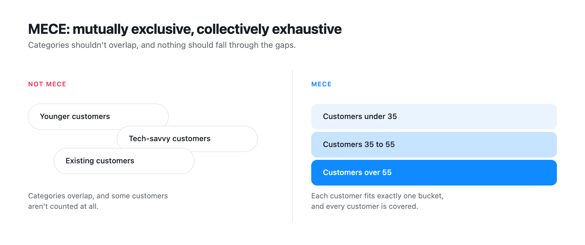
💡 Side note: Barbara Minto pronounces MECE as "meece" (one syllable, rhyming with "niece"), not "Mee-cee" as most at McKinsey say it. As she puts it: "I invented it, so I get to say how to pronounce it."
Why it works: MECE eliminates the "what about..." questions. If your breakdown is truly MECE, you have covered everything without redundancy.
Where you see it: Market segmentation slides, problem decomposition, strategic option analysis.
Waterfall charts for financial analysis
Waterfall charts show how individual components contribute to a final total.
Why McKinsey uses them: They make buildup or breakdown intuitive. You can see exactly how you got from revenue to profit, or from last year's performance to this year's.
Where you see them: Revenue bridges, cost breakdowns, profit variance analysis.
2x2 matrices for strategic positioning
The classic 2x2 matrix plots options across two dimensions (like market attractiveness and competitive strength) to reveal strategic choices.
Why McKinsey uses them: They force clarity about tradeoffs. A 2x2 shows that you cannot optimize for everything. You have to choose.
Where you see them: Portfolio analysis, market prioritization, investment decisions.
Stacked bar charts for portfolio analysis
When showing composition over time, stacked bars reveal both total size and internal mix.
Why McKinsey uses them: They show two stories at once: how the whole is changing and how the parts are shifting.
Where you see them: Market share evolution, revenue mix shifts, customer segment trends.
How McKinsey decks are structured
A typical McKinsey presentation follows the SCQA framework for the opening, then uses the Pyramid Principle to structure the supporting analysis. StrategyU has a deeper walkthrough of how these two frameworks integrate inside the strategy consulting process.
Opening: SCQA framework (slides 1-4)
Situation slide: Establish context and current state
Complication slide: Introduce the problem or opportunity
Question slide: Frame the key question (sometimes implicit)
Answer slide (executive summary): State the core recommendation with 3-5 supporting points
Body: Pyramid Principle structure (slides 5-25)
Supporting analysis chapter 1: First key point with data and evidence
Supporting analysis chapter 2: Second key point with data and evidence
Supporting analysis chapter 3: Third key point with data and evidence
Each chapter typically contains 5-8 slides that build the case for that specific point.
Closing (slides 26-27)
Next steps and implications: What happens next, what decisions are needed
Why this structure works: It is modular. If time gets cut, you can skip chapters 2 and 3 and still have a complete presentation. The opening and closing always deliver a coherent story.
A real example: Women in the Workplace 2022
McKinsey's Women in the Workplace 2022 deck (published with LeanIn.org on the McKinsey & Company SlideShare) follows this structure almost line for line:
Slide 2: Methodology and scale (333 companies, 12 million+ employees, 40,000+ surveyed). Establishes the situation and earns credibility before any argument lands.
Slide 3: "Companies are facing two major [challenges]." Names the complication.
Slides 4 to 6: The core findings, each with an action title that states the conclusion ("Despite modest progress, women are still dramatically underrepresented in leadership," "The great breakup," "The broken rung is still broken").
Slide 7: Chapter divider, "Women's experiences." Slides 8 to 12 build the case.
Slide 13: Chapter divider, "The future of work." Slides 14 to 19 build the case.
Slide 20: Chapter divider, "Recommendations for companies." Closing slides deliver the call to action.
Read by headers alone, the argument is fully there. That is the test of a well-built McKinsey deck.
McKinsey frameworks you can analyze
Beyond presentation structure, McKinsey has developed frameworks that appear repeatedly in their decks.
7S framework
McKinsey's 7S model analyzes organizational effectiveness across seven elements: Strategy, Structure, Systems, Shared Values, Style, Staff, and Skills.
Why it is effective: It is comprehensive without being overwhelming. Seven is memorable. The alliteration makes it sticky.
Three Horizons of Growth
This framework separates growth initiatives into three time horizons: Horizon 1 (core business), Horizon 2 (emerging opportunities), and Horizon 3 (future bets).
Why it is effective: It legitimizes investment in unproven ideas by creating a portfolio approach. It prevents "all or nothing" thinking about innovation.
Value chain analysis
Break down business activities into primary activities (operations, sales, service) and support activities (HR, technology, procurement) to identify where value is created and where costs can be reduced.
Why it is effective: It forces systematic analysis of every business function. Nothing gets overlooked.
Hypothesis-driven approach
Rather than analyzing everything, McKinsey consultants start with a hypothesis about the answer, then test it.
Why it is effective: It creates focus and speeds up analysis. You know what you are trying to prove or disprove.
Why McKinsey's approach works
After analyzing the playbook, patterns emerge.
McKinsey optimizes for executive attention. Every choice (minimal text, conclusion-first structure, one idea per slide) respects that executive time is scarce and attention is fragile.
McKinsey builds credibility through structure. The rigor of MECE frameworks, the discipline of the Pyramid Principle, and the consistency of visual formatting all signal: "We have done the work."
McKinsey removes friction. By excluding decorative elements, dense tables, hedging language, and narrative suspense, they make it easy for executives to focus solely on the recommendation and its logic.
McKinsey forces clarity on themselves. When you have to state your conclusion in the header, you cannot hide behind vague thinking. The format demands precision.
How to apply this to your own presentations
Understanding McKinsey's playbook does not mean copying it blindly. But the principles reveal useful questions:
Can someone understand your deck by reading headers alone?
Does your opening establish situation, complication, and answer?
Are you showing less data more clearly, or more data less clearly?
What are you including that does not directly support your recommendation?
Is your structure hierarchical (Pyramid Principle) or chronological?
Are you building to a conclusion or starting with one?
The McKinsey playbook isn't about looking or sounding like McKinsey, but is instead about making strategic choices that respect your audience's time and cognitive capacity.
The McKinsey presentation advantage decoded
McKinsey presentations work because they are built on disciplined choices about what to include and what to exclude. They respect executive attention. They force clarity through structure. They build credibility through consistency.
These are not proprietary secrets. They are principles anyone can apply: start with the answer, use one slide per idea, make headers actionable, choose the right chart for the insight, and eliminate everything that does not serve the recommendation.
The difference between a good presentation and a great one is often clarity and structure. McKinsey has spent 60 years refining both.
Frequently asked questions
What is the Pyramid Principle?
The Pyramid Principle is a top-down communication structure developed by Barbara Minto at McKinsey in the 1960s. The conclusion sits at the top, supported by 3-5 key arguments, each backed by data and evidence. The structure ensures executives get the full recommendation even if they only read the first slide.
What is MECE?
MECE stands for Mutually Exclusive, Collectively Exhaustive. It is a framework for breaking down problems so that the categories do not overlap (mutually exclusive) and nothing is missed (collectively exhaustive). Minto, who invented MECE, pronounces it "meece" to rhyme with "niece."
What is the SCQA framework?
SCQA stands for Situation, Complication, Question, Answer. It is McKinsey's framework for opening a presentation. Establish the situation everyone agrees on, introduce the complication that creates urgency, name the question that follows, then state the answer (the recommendation). It builds engagement before delivering the conclusion.
How long is a typical McKinsey presentation?
A typical McKinsey deck runs 25-30 slides: an SCQA opening (3-4 slides), three to four supporting chapters of 5-8 slides each, and a closing slide on next steps. Decks are designed to be modular, so chapters can be cut without breaking the narrative.
What chart types does McKinsey use most?
The four most common McKinsey chart types are waterfall charts (for buildups and breakdowns), 2x2 matrices (for strategic positioning), stacked bar charts (for composition over time), and line charts with annotated callouts (for trends with explanation). The choice is functional: pick the chart that makes the insight unavoidable.
What is an action title or talking title?
An action title (also called a talking title) is a slide header written as a complete sentence that states the conclusion of the slide, not its topic. "The retail market contracted 15% in Q4" is an action title. "Market analysis" is not. McKinsey decks use action titles on every slide so the deck can be read by headers alone.


